
FWD design system
- Sep 11, 2025
- 3 min read
Updated: Mar 22
Client background
FWD is an insurance company based in Hong Kong. Founded in 2013 as the insurance arm of Pacific Century Group, the company provides life and medical insurance, general insurance and employee benefits in Asia.
Project objective
Several distinct frameworks depending on the industry. The most prominent is the brand and digital ecosystem for FWD Insurance, though other systems exist for urban way finding and strategic design.

Role
As the UI designer, I meticulously crafted, monitored, and measured the FWD design system for iOS, Android and Google Material Design. My responsibilities ranged from establishing design foundations and developing components to formulating comprehensive design guidelines and design tokens.
Additionally, I worked closely with accessibility team to create detailed accessibility documentation to guarantee a seamless and consistent user experience across all platforms.
FWD design system
Component library
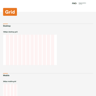
Figma Libraries to support web & mobile components
Released two separated libraries for Web and Mobile components independent of each other.
This offered designers a multitude of benefits, providing a smaller file weight, clear structure of libraries to focus on designers needs, easier data analytics tracking and optimized variant panel. Parity between design and dev is our goal.
We support all digital products in FWD with multiple coding languages, including Material Design, iOS UI Kit, iOS Swift UI, Android Kotlin and Android Jetpack Compose.
Material Design


Guideline & Documentation
Optimize user experience by comprehensive guideline
We have thousands of diverse FWD users on a daily basis, such as journey team designers, developers and project managers.
Documentations is critical to the success of our team by providing a how-to guide for using the design system effectively, and ideally, boosting the level of maturity and expertise of the partnering team members who use it.
Design guidelines (Figma) include but are not limited to typography, colour, header, footer, dialogs, accessibility, patterns, behaviours, usage, examples, etc...


Accessibility
Inclusive and accessible
Needs to meet a high standard for accessibility so all possible group of customers in FWD can use our digital products. FWD digital has an accessibility team to make sure all digital products fulfil latest requirements and our design system team has a dedicated accessibility partner in our creation process.
Accessibility in design system includes many different aspects: sufficient colour contrast ratios, keyboard controls, screen reader, focus states, documentation with annotations and so on. FWD embedded accessibility criteria within the Figma documentation for each component and elevate awareness around designing accessible experiences with clear guidelines.

Contribution model
Scale the system with contribution and inner-source
Given the limited resources of a design system team, FWD leverages the contribution model to grow the MUI library in a UI checklist more efficient way. We promote inner-source in our design and dev community. In that way we can effectively bridge the gap between our existing components and any other patterns that we can serve for product teams.
Instead of being a separate team that builds and maintains the library independently, we see ourselves as an extension product team that ensures governance of quality and system thinkings. We designed a smooth collaboration flow and contribution guideline to empower as many product teams as possible and to allow FWD to scale with the growth of the insurance.
(MUI: The React component library FWD colour UI checklist)
Teams collaboration
It's all about community and collaboration
Internally our team has weekly design syncs to stay informed on what each other is working on and to jam on solutions together.
We partner with different journey teams in different ways. We have a dedicated WhatsApp and WeChat channel where we offer cross-functional support. This is generally the quickest way to ask questions and get in touch with us.
We also hold weekly flexible office hours where designers and developers can collaborate in Figma. Our design system team members try to attend relevant product team open sessions to stay informed of what our design partners are working on and what has been productized. More importantly, we can coordinate efforts strategically across Zhuhai developer teams.
(WhatsApp and WeChat logo)
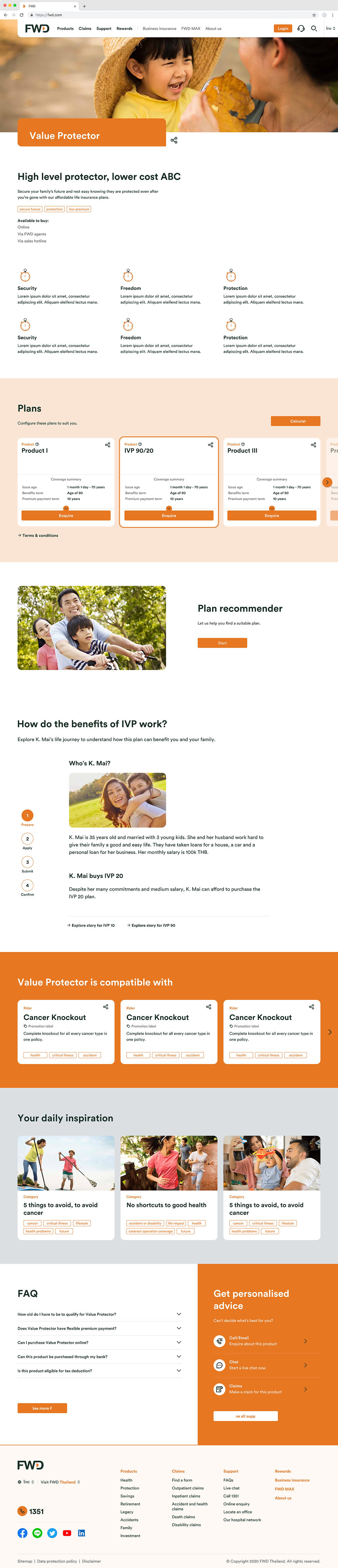
Page template
Product Details
Future support
Light / dark mode switching
Figma has released a major update that allows designers to create variables, which enable design tokens being natively used in Figma.
FlexColorScheme is the ideal platform for implementing design tokens, especially considering that FWD offers a variety of products across distinct themes, including retail, wealth management, and iTrade. Establishing a robust design token structure enables us to effortlessly switch between themes and enhances the efficiency of component development.
(Light / dark mode themes playground)
Comments